
App icon sizes and safe zones: we generated 74 files from two icons
It is tempting to think an app icon is done once the 1024 px artwork looks good. In practice it also appears at 29 px in Settings and 20 px in notifications, and Android devices crop it into circles, rounded squares and other shapes. For this guide we fed two very different source icons into this site's app icon generator, produced 74 files from each, and checked how they look at each size and what goes wrong with Android adaptive icons.
The short answer
- Only the simple icon stayed recognisable at small sizes. The detailed icon blurred from 58 px and was unidentifiable at 29 px.
- Don't put text such as the app name inside the icon. It wasn't readable even at 120 px.
- For Android adaptive icons, using artwork with its own background as the foreground leaves a square edge inside the shape. Separate the symbol on a transparent background and set the background layer separately.
- Give iOS a plain square icon; don't round the corners yourself. The system does it.
Which size goes where
| Platform | Main sizes (px) | Where it's used |
|---|---|---|
| iOS | 1024 / 180·120 / 87·58·29 / 60·40·20 | App Store / Home Screen / Settings / Notifications, Spotlight |
| macOS | 16–1024 (1x, 2x) | Dock, Finder, list views |
| watchOS | 48–234 | Notifications, launcher, Quick Look |
| Android legacy icon | 36·48·72·96·144·192 | ldpi–xxxhdpi launcher (mipmap) |
| Android adaptive foreground | 108·162·216·324·432 | 108 dp canvas, cropped to the device shape |
| Google Play | 512 | Store listing |
These are the generator's presets. The slots you actually need depend on your project's minimum OS version and target devices, so check for missing-icon warnings in Xcode and Android Studio.
How we tested
We created two 1024×1024 sources with a GPT image model: (1) a simple icon with one white paper plane on an orange gradient; (2) a detailed icon with a wallet, bar chart, coins, a calendar and thin “Daily Budget Planner” text. Both went through the app icon generator's real generation function. Environment: Chromium 152 on Windows, September 2026.
| Source | Files | Total size | ZIP size | 120 px file | 29 px file |
|---|---|---|---|---|---|
| Simple | 74 | 5.71 MiB | 5.73 MiB | 17.9 KiB | 1.5 KiB |
| Detailed | 74 | 6.96 MiB | 6.97 MiB | 25.3 KiB | 2.0 KiB |
Generation took under a second on a PC for both. PNG is already compressed, so zipping barely changes the size; most of it comes from the 1024 px master and the large macOS sizes.
Result 1 — Which icon survives small sizes
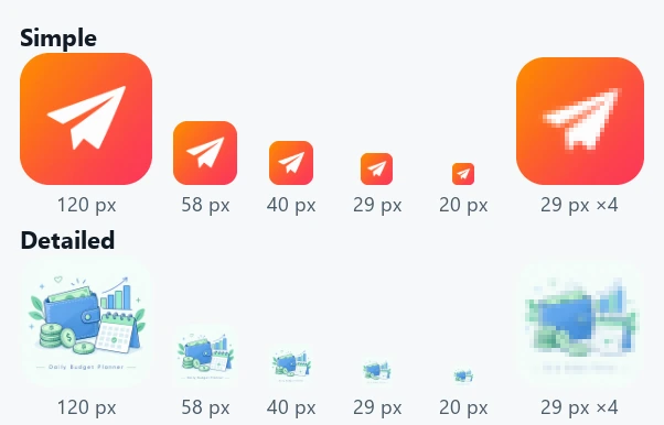
The simple icon still read as a paper plane at 20 px. The detailed icon's text was unreadable even at 120 px, the wallet and calendar merged into one blob at 58 px, and the enlarged 29 px version showed only blue and green smudges. A 29 px Settings icon is effectively a 29×29 mosaic, so thin lines and small letters blend into one or two pixels and vanish.
The quickest check is to shrink the 1024 px artwork to fingernail size on a phone screen. Aim for one symbol, bold strokes and strong contrast with the background; save the detail for store screenshots.
Result 2 — The square edge in Android adaptive icons
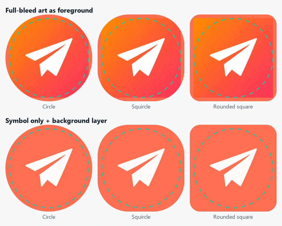
Adaptive icons on Android 8.0+ consist of a 108×108 dp foreground and background layer; the device shows only the central 72 dp, cut into a circle, rounded square or other shape. To avoid clipping, the logo must stay inside the central 66 dp circle. This generator places the source in the central 66 dp of the 108 dp canvas, about 61.1% (264 px in the 432 px file).
The trouble starts when the source has a painted background. As in the top row, the whole square becomes the foreground, and squircle or rounded-square masks reveal an inner square edge. As in the bottom row, feed the generator a transparent PNG of the symbol only and set the background layer to a colour or separate image in your adaptive-icon XML, and every shape looks clean.
Don't calculate with “66%”. 66 dp is about 61.1% of 108 dp, so fitting the logo into the central 66% makes it larger than the safe zone.
What to check for Apple icons
iOS and watchOS app icons may not contain transparency, so this generator fills transparent areas with the chosen background colour (white by default). If you use a transparent logo, try your brand colour instead. If the source already has rounded corners, the system rounds it again and the background colour shows in the corners, so provide a plain square.
The ZIP's Xcode/AppIcon.appiconset folder contains the PNGs and Contents.json and fills the slots when added to your project's Assets. Multiple targets, Watch extensions and Apple's new layered icons (Icon Composer) are not configured automatically, so check for warnings after building.
Workflow
- Prepare a square source of at least 1024×1024. Rectangular images are cropped from the centre.
- For Android adaptive icons, prepare a separate transparent PNG with the symbol only.
- Check the generator's previews to make sure the icon is recognisable at 29 px and 40 px.
- Download the ZIP: add AppIcon.appiconset to Xcode, and the mipmap folders and adaptive foregrounds to Android Studio.
- Check the Home Screen, Settings and notifications on a real device or emulator.
Common mistakes
- Enlarging a small source: a 1024 px icon made from a 512 px source looks blurry. The generator warns about this.
- Writing the app name in the icon: the name is already shown under the icon.
- Filling the logo to the edges: adaptive icons will cut off its ends.
- Checking a white icon only on white: also look at it in dark mode and on coloured wallpapers.
How this tool works and its limits
Everything runs in the browser and the source is never uploaded. The output is static PNGs and a classic AppIcon.appiconset. Android monochrome themed icons, white notification icons and Apple's dark and tinted variants are not produced; add them in your development tools if needed. Producing a set of PNGs is not the same as passing store submission checks.